Trading and variable income platform redesign
Making the trading and variable income investing experience more engaging and fluid.
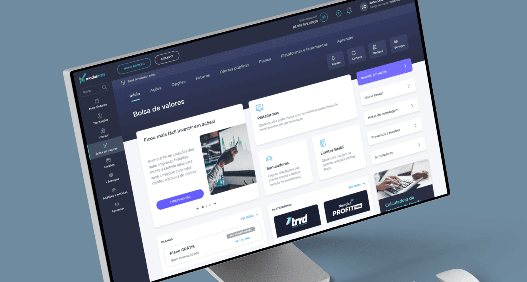
CONTEXT
Critical Segment, Overlooked Experience
The trading and variable income segment represented the most valuable client cluster in terms of revenue at Modalmais Bank.
Despite its importance, this segment posed significant challenges for designers. Most decisions tended to be centralized around business leadership, with minimal space for discovery or evidence-based design inputs, often resulting in suboptimal UX and design choices.
In our ongoing efforts to demonstrate the value of design and improve the user experience, our team aimed to deeply understand how we could enhance the UX of our web app — making it not only more intuitive but also more engaging through marketing initiatives.
We started with the web app because, at that time, most of the features for investing in these products were only available through the desktop platform.
Key objectives
- Identify and prioritize major pain points and friction in the digital experience
- Gather spontaneous feature suggestions and improvement ideas
- Cross-check perceptions with the most cited products and services
- Co-create an actionable plan with stakeholders from the Variable Income team
PROBLEM SPACE
Understanding user perception of the trading and variable income portal
I led a large-scale satisfaction survey with 5,705 respondents, complemented by qualitative analysis of 392 open-ended comments. We also analyzed navigation recordings and heatmaps to uncover behavioral insights.
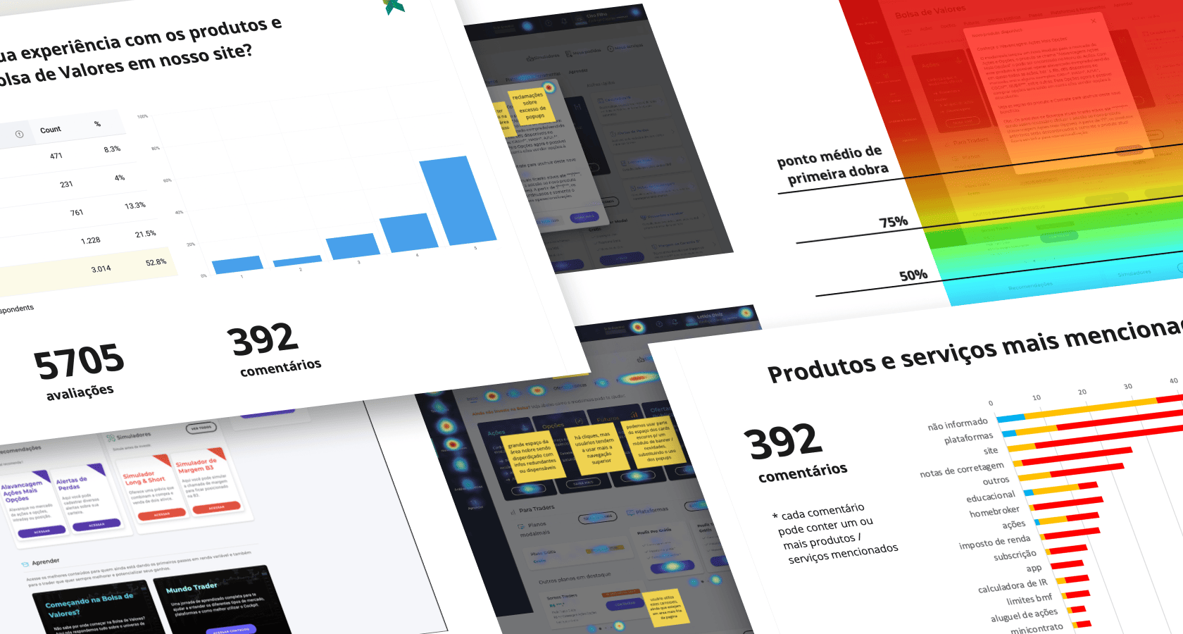 Survey, navigation recordings and heatmaps.
Methodology
- Channel & Method: In-site Hotjar survey (5-star, CSAT)
- Approach: Manual tagging and categorization of issues
- Sentiment Analysis: Positive, Neutral, Negative
- Additional Inputs: Navigation recordings, heatmaps
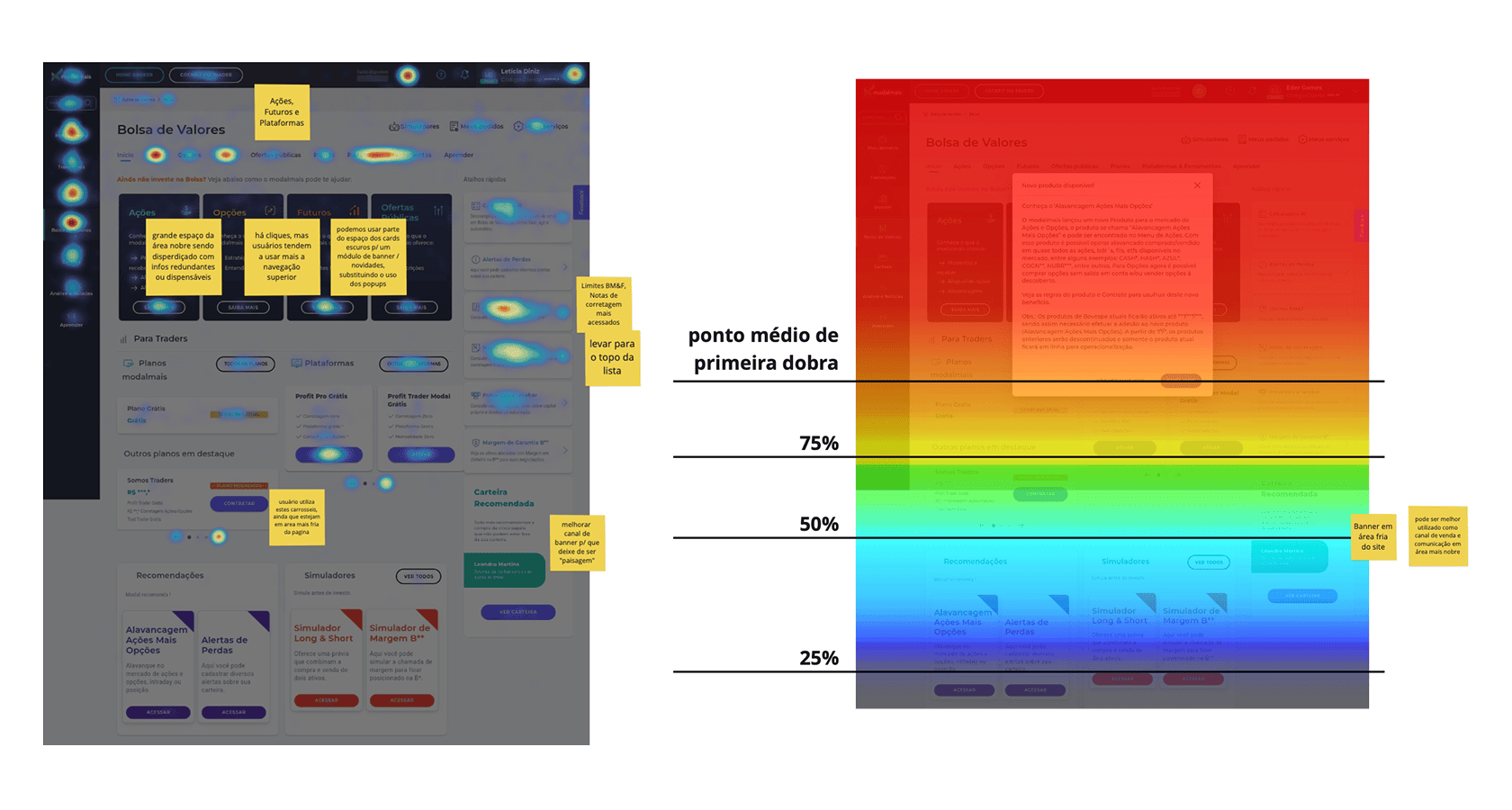 Heatmaps of the old trading and variable income investments home
Insights from user comments
The site and investment platforms were the most frequently mentioned services — especially regarding usability and navigation.
Recurring themes included:
- Platform instability
- Usability issues
- Functional and navigational complaints
- Negative experiences with cancellation flows, popup overload, and brokerage note access
Deep dive: usability & site experience
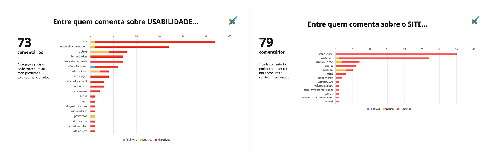 Comments mentioning usability and site.
73 comments referenced usability, with the most common complaints being:
- Confusing or inconsistent navigation
- Difficulty locating brokerage notes
- Gaps in information architecture
79 comments directly mentioned the site, including issues like:
- Page loading failures (especially in the Bolsa section)
- Excessive popups
- Lack of clarity in communication and feature flows
Summary of key insights
We grouped the findings into five main categories:
- Structural: Instability, incorrect balance information
- Support: Lack of tutorials, educational content, or advisor availability
- Communication: Unclear messaging and conditions for free features, billing issues
- Usability: Friction in completing tasks, especially regarding tax reports and brokerage notes
- Costs: Complaints about expensive margins, fees, and tax calculator tools
Users also suggested improvements such as:
- Showing average acquisition prices
- Automating stock lending
- Improved IR support and documentation
- More educational and psychological resources for investors
- Better visibility into buying power and permissions
SOLUTION SPACE
UX prioritization
As the UX Strategist on this project, I led a co-creation workshop with the Variable Income team to define priorities and next steps. A second round of research was planned after these three phases to evaluate outcomes and determine next priorities.
Phase 1
- Redesign of the homepage
- Improvements to menu behavior and navigation consistency
- Definition of core visual and interaction standards
Phase 2
- Optimization of third-party platforms activation flows
Phase 3
- Complete redesign of the brokerage note experience
Solution design & validation
Based on the consolidated findings, I led the creation of wireframes to align the design direction with stakeholders from product, tech, and business.
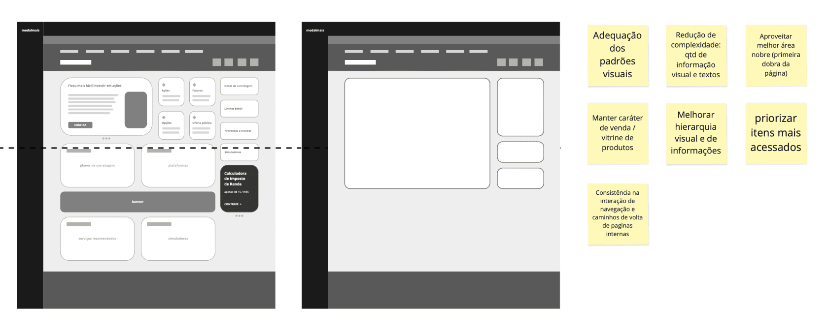 Wireframes
We validated the concept through quick usability tests with internal users matching our trader and investor personas. Feedback confirmed improvements in clarity and navigability.
This validation led us to move forward with UI production.
SOLUTION REFINEMENT
Final UI and rollout
After approval, we implemented the new interface and navigation patterns.
Key changes included:
- Cleaner visual and content hierarchy
- Fewer popups and reduced visual clutter
- Direct access to essential tools and documents
- Smarter placement for marketing content — no longer relying on popups
- Stronger UI and design consistency
- UX writing improvements to enhance clarity and comprehension
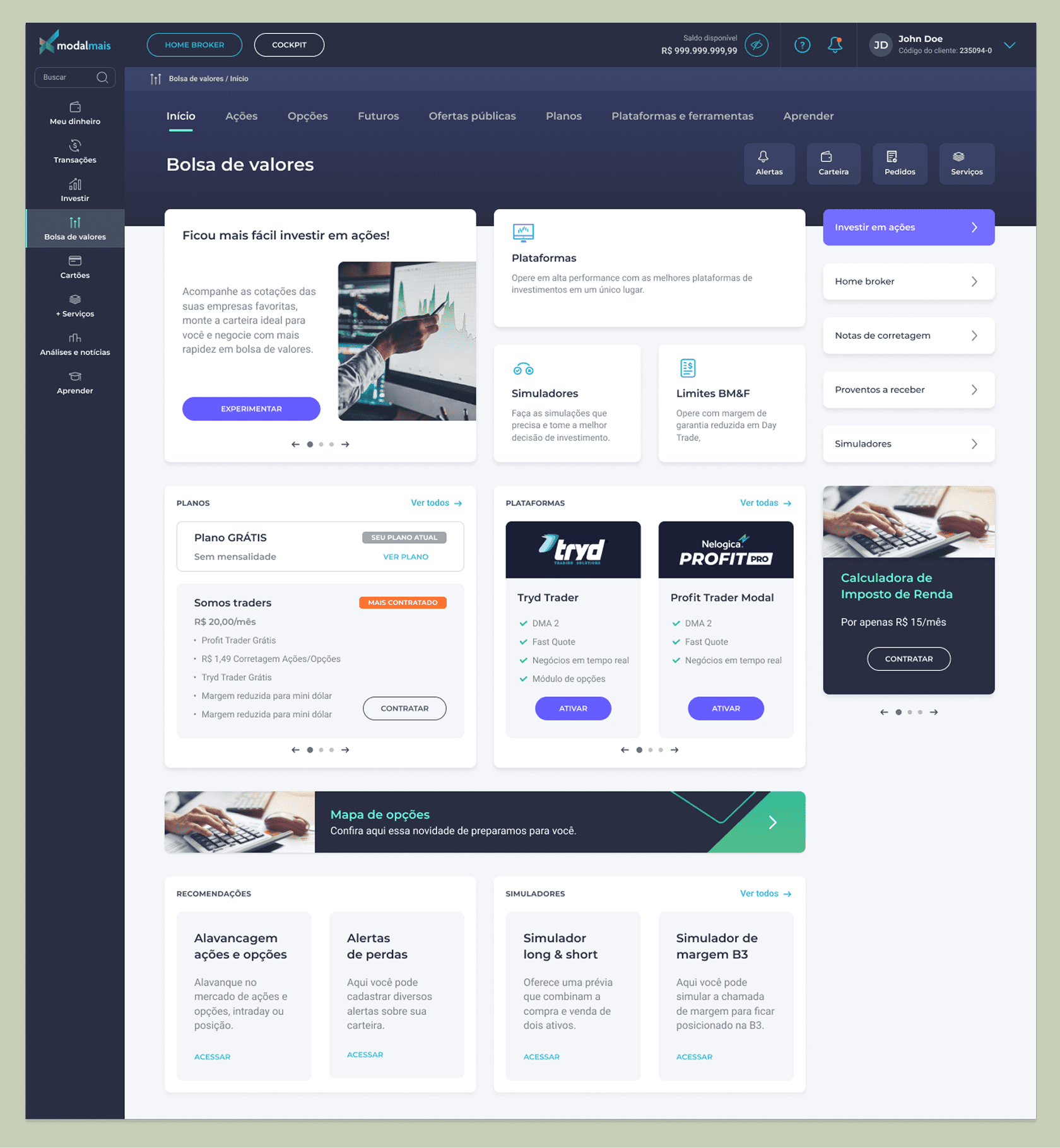 Web platform redesigned, home screen.
RESULTS
A redesign that delivered results
Following the implementation, we observed significant improvements:
- Higher NPS and CSAT scores for the Variable Income segment
- Fewer support tickets related to brokerage notes and navigation issues
- Increased engagement in marketing campaigns for investment products
- General uplift in revenue during the following quarter (though UX’s direct contribution was not isolated)
REFLECTIONS AND KEY LEARNINGS
Strategic UX is a team game
This case reinforced how qualitative research, when combined with behavioral insights, can shape strategic UX improvements. It also highlighted the value of collaborative planning and iterative design — especially in the context of complex financial products.
We continued enhancing the experience through ongoing cycles of research, testing, and improvements aligned with business goals.